Pages

VAKKO FASHION CENTER Istanbul, Turkey Designed By REX


CLIENTS Vakko and Power Media
PROGRAM Headquarters for a Turkish fashion house—including offices, showrooms, conference rooms, auditorium, museum, and dining hall—as well as the television studios, radio production facilities, and screening rooms of its media sister-company
AREA 5,400 m² (58,000 sf) and 3,700 m² (40,000 sf)
COST Confidential
STATUS Completed 2010
ARCHITECT REX

When Caltech’s senior administration suddenly changed, REX’s design for the Annenberg Center for Information Science and Technology was canceled. Two months later, the CEO of Vakko (Turkey’s pre-eminent fashion house) and Power Media (Turkey’s equivalent of MTV) approached REX with plans to design and construct a new headquarters by the year’s end using an unfinished, abandoned hotel. The requested timetable would normally have been absurd. However, the unfinished building fortuitously had the same plan dimension, floor-to-floor height, and servicing concept as the Annenberg Center’s “Ring” (the so-called “Sheep”).

By adapting the Construction Documents produced for the Annenberg Center to the abandoned concrete hotel skeleton, construction on the perimeter office block commenced only four days after Vakko/Power first approached REX. This adaptive re-use opened an eight-week window during which the more unique portions of the program could be designed simultaneous to construction. Speed became the design’s most significant parameter.

Whereas the Annenberg Center’s Ring was a fragile, post-tensioned concrete structure which depended upon the robust, steel interior for support, Vakko/Power’s existing Ring is painfully over-designed, the byproduct of numerous, deadly earthquakes in Turkey.

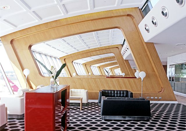
The design problem is therefore reversed: Vakko/Power’s unique interior must remain detached so as not to disrupt the structural integrity and waterproofing of the in situ skeleton. Dubbed the “Showcase,” this unique interior houses the auditorium, showrooms, meeting rooms, and executive offices, as well as all vertical circulation and restrooms...more

Corporate Office Interior Design | Aramco Overseas Company Den Haag, Netherlands By Group A

The Aramco Overseas Company head office has recently moved into their new accommodation in The Hague. The new office, housed in an existing building from the eighties, needed to be fully refurbished. Following a selection in March 2009, GROUP A was chosen to carry out this refurbishment.

The design challenge the team stood for was to strengthen the rather unobtrusive character of the existing building by means of a new interior. GROUP A resolved this by designing an interior that uses the more noticeable aspects of the existing building as a guiding principle, while reflecting AOC’s identity.
This identity is based on the cultural background of AOC, which is part of the Saudi-Arabian oil company Saudi Aramco. The interior subtly refers to this background by using patterns, colors and materials that are typical for Middle-Eastern architecture, in an abstract, contemporary manner.
The building comprises two wings of five office floors each, situated around a central atrium. GROUP A’s design strengthens the atrium’s function as the heart of the building, and is based on the rationality of the existing building. It is fitted out with large cubic elements which serve as lighting elements, and make the atrium glow with light. The atrium walls are partially covered with mirroring glass, which leads to an unexpected play of connections between the different floors. A meandering reception desk serves as a connecting element between the atrium’s different functions and areas, and as a guiding element for visitors.
The concept for the offices on the upper floors is based on a combination between a classical cellular office and a more informal open office layout. By inserting a continuous wooden element over the full length of each floor, visual coherence is ensured.
This element at the same time serves as an entrance to the cellular offices, and comprises cabinets, wardrobes and seating units. The other divisions are mainly made up by glass screens, covered with an abstract, semi-transparent print. Glass and wood, open and closed are deployed in such a way that there is maximum use of daylight.
The original concrete walls, which are visible at a number of places throughout the building, are covered in textiled panels, like large paintings.Shared functions, like the break-out which is located on every individual floor, are situated along the atrium. On the ground floor, the office wings house a number of special facilities, among which a restaurant, an exhibition area and a prayer room.

The cooperation between AOC, GROUP A and Verwol was very successful, making it possible to create an exceptional project in an exceptionally short period of time....more

Retail Interior Design By Leong Leong For 3.1 Phillip Lim - Los Angeles


By introducing a thick curving wall within the existing 5000 s.f. building envelope, one large main space unfolds into four smaller nooks. Mirrors along the walls enhance the spatiality of the store and create visual continuity between adjacent spaces. The curving geometry and thickness of the wall allows for the conventional methods of lighting and display to be rethought through the logic of the niche, while a single, continuous light-diffusing membrane floats above the space, giving a sense of depthlessness.

Like the construction of a garment, the curving wall has an inner lining and outer lining. The various spaces generated by the curving wall are lined with textures to create a varying ambient effects.

The exterior facade has no openings except the entrance. The facade is surfaced in a supple pattern of convex concrete tiles.

In collaboration with Para-Project & Office Giancarlo Valle.....visit Leong Leong

Retail Interior Design | Charles Fish Jewellery,Canary Wharf, London Designed By Nigel Coates


Fish
2005

Charles Fish have been selling fine jewellery in the East End of London for 150 years. It follows that their new shop at Canary Wharf should mix history and modernity. This project makes a jewellery box out of the shop itself. Retrieved wardrobes and cupboards are half sunk into the walls, while a new chandelier design by Coates creates a focus for the shop.....more

Restaurant Interior Design | Wallop Restaurants,Glyndebourne,UK Designed By Nigel Coates


Glyndebourne, 2009

The interior of the new Wallop restaurants has been designed by Nigel Coates and his design team. By using serpentine banquettes, towering waiter stations and a series of interconnecting levels, his design defines many distinct areas. Coates has also imbued the project with a sense of theatre. Patrons will no doubt recognise some fittings from past Glyndebourne productions including a large-scale mural from La Traviata. The decor also features many props chosen from opera house productions. All the furniture has been designed by Coates, and forms part of his Scubist collection for Italian company Fratelli Boffi. The design also incorporates a ‘cloud’ of the new chandeliers he has realised with Swarovski Crystal Palace. This stunning installation consisting of 43 so-named ‘Cloudeliers’ that hang in a central zone of the restaurant, visually connecting its three levels. These have been made in collaboration with the Italian lighting company Slamp, and incorporate crystals of Coates’ own design........more

Cafe Interior Design | Cafe Bourgeois Collins Street Docklands ,Victoria,Australia By Minifie Nixon


An idealised other dimensional space is flattened to the wall of the cafe.

Cafe Bourgeois is located in the suddenly urban docklands area, located adjacent to the front door of the new Myers building.
The cafe identity and architecture are entwined, the spatial gymnastics implied by the wallpaper mirroring the ironic ambitions of the franchise name.

This idealised three dimensional space imprints on the cafe walls an other worldly quality - a backdrop for glowing displays and the relentless warmth of the polished joinery end-grain, and the resilient reception of the rich Marmoleum colours underfoot....more

Furniture Showroom Design | Happy Ever After By Tord Boontje for Moroso


Happy Ever After was filled with ideas about nature and technology coming together. The materials like the wool and silk fabrics are cut in such way that they create an organic atmosphere in the space: a space where things are hidden, waiting to be discovered.

Another important inspiration for me is fashion and the way in which we use fabrics on our body. I try to bring some of this sensuality to the designs. In the series of 7 chairs, I designed these as different characters that you might meet in a story; the princess, the pirate, the witch, the prince etc....more

Furniture Showroom Design | The Little Wild Garden of Love By Studio Tord Boontje For Moroso


You enter a dark place which represents night or, better still, a rainy night, where we find some Moroso pieces which are familiar to us: little Albert, O-Nest, Supernatural, Osorom, Shiitake…

The entrance is at once spectacular and dramatic. It is the place where everything begins to spring to life. After the dark and rainy, yet seductive and mysterious, night comes the reassuring and clear day.

Rainwater is the lifeblood of our garden, you then catch a glimpse of a wild and lush vegetation and enter a landscape which is larger, more airy, throbbing and bright.

Along the way you can experience different emotions by choosing different directions and visions: the peace and calmness of the serene and romantic white garden, the powerful stimuli of the psychedelic and symmetrical garden or the vibrant energy of the colourful and revitalising garden.

An installation for the Moroso showroom, Salone del Mobile.....more

Restaurant Interior Design | Lumiere, Cuisine Restaurant By WKDA

The proposed design is for one of Hong Kong’s most luxurious and high end restaurant at the IFC mall. In response to the long circulation, the design proposed a series of dynamic sculptural responses to encourage and direct circulation at certain critical junctions. The swooping motions of the wooden curve pieces suggest and encourage and discovery within the corridor spaces, at the same time not to overwhelm the existing renovation work which was requested by the client to be kept. The pieces act as mediation at the front French window, providing privacy and permeability concurrently......more

WKDA is Hong Kong-based architecture practice led by principal Michael Wing C Kwok. We are a registered architectural practice with the Hong Kong Institute of Architects, with a team comprised of professional architects, interior designers and surveyors. Our work’s focus is in alterations and additions works, renovations and rehabilitation, and interior design. 

We operate as an open-minded design studio emphasizing critical thinking, design intuitions and open communications. Creativity, imagination and free thinking are center to our values. Critical thinking helps substantiate the work we produce, and provoke positive responses. Through a creative, innovative and cross-disciplinary design approach, we aim to build works that speak of our values, and embody a spirit that communicates. This spirit is reflected in our office’s culture, and make up of energetic and entrepreneurial minded individuals. WKDA seizes every opportunity to explore the peculiarities in every given project, offering wide ranging solutions.

Salon Interior Design | Mizu Salon, Mandarin Oriental Hotel,Boston | Niall McLaughlin Architects


Mizu Salon is in the Mandarin Oriental Hotel, Boston, facing onto the Arcade and Gardens beyond.

The key design issue is the comfort and wellbeing of each customer. This is an environment that is calm and uplifting. A customer should leave the salon feeling nurtured.

Soft spaces are created through strategic reflective lighting, light boxes and soffits. The cool colour temperature creates a sense of calm and cleansing whist warm gold colours introduce a feeling of relaxation and comfort.

An arcaded passageway extends along the glass shop window. It leads from reception to hair cutting, dyeing and colour dispensary. This passageway makes a sculptural form when seen from the mall. It acts as a screen, making the cutting room a protected inner sanctum.

The simple vaulted cutting room is animated by repeating cuts in the soffit, which open into brightly lit spaces. When you lie back at your basin, you gaze on the ceiling's beautiful geometry....more

Museum Interior Design | Science Museum, Discovery World, Pier Wisconsin By La Dallman


Located in the Discovery World at Pier Wisconsin hand’s on Science Museum, this project is a permanent, interpretive exhibit of the Great Lakes watershed, the region’s greatest natural resource. The program weaves together historic, scientific, and topographic data conveying information such as weather patterns, geological history, animal life, and water movement. The program requiresthe integration of highly technical life support systems for aquatic and amphibious life, digital imagery, interactive displays, cartography, fossils, and real-time atmospheric data.

Describing two ecosystems of the terrain and sky, the design reveals opportunities to explore the intersection between man-made and natural systems-- illuminating the primordial relationship between earth and sky. Moving fluidly within the building’s column grid, the terrain and sky create cinematic views of the landscape beyond. Through a highly iterative design process in form-making and fabrication (marrying both high-tech and primitive technologies), the design mediates between the organic and the man-made, the physical and the atmospheric, the neutral, existing space and the flexible, complex insertion, the grounded and the celestial....more

Corporate Interior Design | Unilever PLC By Kohn Pedersen Fox Associates


Location:London, UK
Client:Unilever PLC 
Area:386,000 ft2 / 36,000 m2
Awards:AIA National Chapter Honor Award for Architecture (2008), MIPIM Awards - Refurbished Office Buildings (2008), ULI Award for Excellence: Europe (2008)

The transformation of historic Unilever House involved preservation, conservation and restoration of the exterior façade and key interior spaces, as well as the complete renovation, reconfiguration and modernization of the building interior. Occupying a prominent site on the Victoria Embankment overlooking the River Thames, the building was originally completed in 1932 and listed as a Grade II landmark structure in 1977. The building has served as the headquarters for Unilever since the early 1930s.

Extensive consultation was held with Unilever employees to develop a design to provide high-quality office space that responds to the company’s operational requirements while retaining important parts of the building to safeguard its historic character.

Office accommodation has been provided in the restored and extended Crescent and Watergate wings, and a new central atrium hosts the main circulation area, bringing natural air and light into the center of the building. KPF’s design re-opens the original main entrance at the center of the Embankment façade, with minor adjustments for universal accessibility.

Public spaces are located at ground level, while meeting rooms and staff facilities are on the top floor of the building. The scope of work also included improvements to infrastructure, parking, and vehicular drop-off areas.

In addition to receiving the AIA National Chapter Honor Award for Architecture, the Institute’s highest honor, this project was recognized with the City Heritage Award for Outstanding Excellence in the Renewal of Buildings and Conservation and the AIA New York Chapter Sustainable Design Award recognizing is achievements in energy efficiency and materials conservation and reuse.......more

Office Interior Design,Shinagawa, Tokyo | Beacon Communications | Klein Dytham architecture


All materials and colours are chosen based on each theme. The ribbon construction on each floor are the following: wood for the family’s floor, steel for men’s floor and pink snake skin for women’s floor. As a result, this office has become Beacon’s own advertisement as well as an appealing showroom for he future client...more

Temporary Library Interior | Gruppoa12


Exhibition "Strategies Against Architecture II", Fondazione Teseco, Pisa 2001

An industrial container is customized to contain a transportable library. The roof is removed, the interior is painted pink. A new raised level, built out of steel I-beams and metal grating is inserted inside the container and becomes accessible through a steel staircase. The library becomes a point of observation of the surroundings. Books and material concerning the artists and topics of the exhibitions in which the container is inserted are available to the public thus defining a space of rest and meditation.

Il progetto lavora su due piani distinti: la realizzazione di un oggetto e uno spazio fruibile all’interno della mostra e la costruzione di un confronto indiretto con gli altri partecipanti all’esposizione. L’intervento prevede l’allestimento di due spazi: uno esterno costituito da un container riadattato e trasformato in biblioteca temporanea in cui sono mostrati i differenti testi che gli artisti presenti in mostra hanno segnalato come significativi del proprio percorso di ricerca, l’altro,negli spazi interni della fondazione, destinato a diventare uno spazio di lettura e consultazione dei libri scelti.....more
photo: Alessandro Cimmino

Museum Interior Design | Votorantim,São Paulo By Metro Arquitetos


Located in a historical building in São Paulo central district, in the Ramos de Azevedo Square, we designed a space to show the history of the Votorantim group, focusing on the metals sector.

The objective of the design is to provide a sensitive experience and not just a support fot informmation: the material itself is the content. With an emphasis on materiality, we showed all the stages of the production process, from the extraction of the mineral in its most raw state until the production of the thinnest sheet, incorporating as well the intermediate stage which are normally omitted. That materiality was also tensioned by the use of raw materials worked on with advanced technologies: solid blocks and sheets cold cut with water jet following CAD designs, complex geometries such as the twisted ellipses made of rods, aluminum plates cut with conforming the organic shape of the ceiling.

Another aspect emphasized by the exposition is the territorial dimension of the company, in two ways: the extensive network established between the places of production, distribution, and the logistics involved, which today has a global dimension; and the degree of physical intervention on the site, with the extraction, the building of dams, the installation of large factories and of enormous transportation lines and the consequent challenge that is continuing this evolution in a sustainable, social and environmentally responsible way....more
Date: 2007
Completion of construction: 2008
Architecture design:
Martin Corullon, Anna Ferrari e Gustavo Cedroni
Paloma Delgado e Paula Mendonça [colaboradores]
Construction area: 592 sq ft (550 m²)
Management of projects and construction: Carlos Lensoni
Lighting design: Ponto Elétrico - Ricardo Heder
Graphic design: BVY arquitetos associados, Cássia Buitoni
Air conditioning: Cold-Express

Photographs: Leonardo Finotti

Corporate Interior Design | Qantas First Lounge, Sydney | Woods Bagot


Led by the vision of internationally renowned Australian designer Marc Newson in collaboration with his associate architect Sebastien Segers and Woods Bagot, the new flagship Qantas First Lounge in Sydney sets an international benchmark in lounge design with the highest levels of comfort, service and luxury....more

Apartment Interior Design | White Apartment |Timişoara | Romania By Parasite Studio

From the first design sketches we tried to get distance from the interventions that have become „standard procedures” in the local scene of designing within old buildings. The owner, a jazz passionate, wished for an elegant and flexible apartment of high standard, with vast multifunctional areas within the living space. The design we settled upon was an intervention where the white color is dominant and plays the role of a clean background on which the main theme of the apartment is evolving – the furniture, which is treated as a unitary contemporary insertion.

PROJECT TEAM: PARASITE STUDIO
ADRESS: Timisoara, RO
PICTURES: Andrei Margulescu & Arhitectura / PARASITE STUDIO

Retail Interior Design | Cynthia Leight Opticians By Space International | Los Angeles, California


Design for a small eyewear boutique situated in the ground floor of a parking structure. The design takes advantage of this unique situation by creating a horizontal backdrop of product display which runs parallel to the pedestrian activity of Robertson Boulevard. Intricate display elements constructed from glass and stainless steel float between the heavy concrete floor and ceiling of the structure and reflect the delicate craft and precision of the eyewear for sale....more

Cafe Interior Design | Café de Leche Highland Park, California | Freeland Buck

Café de Leche was developed as a new center of Highland Park, a public hub where the local residents could enjoy high quality coffee and mingle with friends. The corner site and expansive windows suggested developing the long elevation inside the cafe as a kind of billboard with an image of the San Fernando as mountains seen from inside the cafe.
The counter and partition walls are set at a subtle angle, producing a tension between elements that extend and foreshorten views into and out of the café and further activating the space. The long bench and angled walls also maximize space and seating. The deep space is anchored by the children’s play area, which has become a popular meeting place for moms and kids.
Mural Installation: Biayna Bogosian, Joel Cota, Brice Linane, Jason King, Jason Prado, Greg Zamora 
More

"FreelandBuck is an architectural design practice based in New York and Los Angeles affiliated with Yale and Woodbury Universities. Our office focuses on research and design, exploring the overlap between academia and practice.

At a point when digital architecture is nearly two decades old, our work assumes that fabrication and construction can enhance the spatial and sensual qualities of digitally designed form rather than compromise them. By articulating the patterns inherent to structure, construction and material, we invigorate forms and spaces with specific character and rich atmosphere.

We seek to design evocative buildings that engage with the 'language' of atmosphere and affect with which we negotiate our social and political worlds. In this context, walls, ceilings and floors become emissive boundaries that infuse space with character, making them habitable and memorable. As environments for human interaction, our work exploits both formal undulation and graphic variation - of pattern, color and material - to synthetically enrich surface and space.

At the scale of the city, pattern also holds an inherent organizational logic. Our design research explores complex configurations of natural and infrastructural systems supple enough to insinuate themselves into the existing geometry of the city. Patterning, unlike smooth topological surfaces, collects disparate fragments and allows for moments of inflection: differentiation, distinction, or disillusion within a continuous system. As both an organizational and design strategy, patterning suggests "re-grounding" digital architecture in the material world."

Showroom Interior Design | Haworth Chicago Showroom Chicago, Illinois | Perkins+Will


Completion Date: 2004
Square Footage: 29,000
LEED Gold Certified
Awards:
Institute Honor Award for Interior Architecture, 2007 AIA
Interior Design Award, Best of Competition, 2005 IIDA
Showroom & Booth Design Competition/NeoCon Best of Show Award, 2004 IIDA

The Haworth Chicago Showroom is a sales office, conference facility and product showplace demonstrating the company's evolution to a solutions-driven resource for workspaces. The Chicago showroom is the first of many global Haworth showrooms designed by our Branded Environments team and is a leading example of sustainable design from social, environmental and economic perspectives.

Over a period of six consecutive years, we developed brand image, strategic positioning, market communications and environmental elements to support Haworth's platform of adaptable workspace, designed performance and global perspective. The design showcases the concept of "workspaces", demonstrating full integration of interior architectural systems including furniture, modular walls, raised flooring, ceilings, HVAC, lighting, sound, power, voice and data. Our design addressed performance through alternative concepts of "work" and "restore" (including elements such as the large reflecting pool) and utilized a clean aesthetic with high "green" performance. The Chicago showroom, an expression of Haworth's mission and a showcase for its solutions, marked the beginning of our lasting partnership with the company.
 Perkins+Will

Public Building Interior Design | Curno Library and Auditorium | Curno - Bergamo, Italy | Archea


LOCATION: Curno - Bergamo
PROJECT: Biblioteca e auditorium
CLIENT: Comune di Curno
STRUCTURES: Studio Myallonnier
SYSTEMS: Studio Armondi
PLAN: 1996
REALISATION: 1999-2009
COST: € 2.000.000,00
BUILT AREA: 1.960 mq
VOLUME: 8.200 mc
CONTRACTOR: Viola Costruzioni
The site for the building of a new public library and a small auditorium with 250 seats has been found inside an existing school campus. The location has suggested the idea of a project centred on the continuity of the surrounding public area. The building, conceived as a kind of open book, is therefore characterized by a sloping roof which is terraced to form stands, and which may be used for open-air events, to extend the public square in front to the roof of the building. The plan distinguishes the activities which pivot on the rectangular hall of the auditorium from the areas of the library, whose perimeter consists of a longitudinal outline characterized by the jagged geometry of the external facade. The line of demarcation and communication between the two areas takes the form of a new urban itinerary, a triple-height void paced horizontally by a system of split levels which in their turn serve as communication paths, and vertically by a succession of uprights which structure the entire wall as container case of books. The materials, which have been reduced to the essentiality of an untreated concrete mixed with colour, have made it possible to mould the vertical surfaces as the pages of a conceptual book, engraved here and there with letters.....more

Retail Interior Design | Microaudio Shop,A Coruña, Spain By Juan Morandeira


A hearing aid store itself is structured as auditory system, but without falling into the typical postmodern mimicry. One zone, more public, visible from the street, characterized by open spaces, predominantly white and whose parts are separated by walls with different perforations. The decor with pictures of a baroque palace gives greater breadth and imposture.
Changing to the query is like stepping into the inner ear. A curved hallway leads to the waiting room, oval, with no windows and a pink light that bathes everything, which seeks an atmosphere of calm, tranquility and security....more

Office Interior Design | Maxan Office,A Coruña, Spain | a.f. architects Abeijón-fernandez


Project: Offices Maxan
Designer: a.f. architects Abeijón-fernandez
Architect José Vela Abeijón
Architect Miguel Fernandez Racing
Location: A Coruña, Spain
Building Size: 632.46m2
Photo: © Santos-Diez

The commissioning of the new offices of Maxana providing us the possibility of linking the working spaces with the work taking place inside. It is about connecting the treatment of the physical environment with activities in it. Being an advertising company, image interpretation techniques and trends in advertising and marketing as well as some ephemeral changing environment and move the processing of fixed elements that make up the space...more
Original text in Spanish by Arquitour

Retail Interior Design | Carlos Miele Flagship Store Paris | Asymptote Architecture


LOCATION: Paris, France
SIZE: 230 sq.m
DATE: 2003
Carlos Miele’s new flagship store, designed by the New York-based firm Asymptote Architecture, opened last year at 380 rue Saint-Honoré. The design of the 230-square-meter, two-story store takes its inspiration from a combination of influences including Brazilian masters Oscar Niemeyer and Roberto Burle Marx and their interest in abstract figurative affinities, the French Baroque and Parisian Art Nouveau, all tempered by the precision inherent in new technological means of manufacture and design. The store was conceived to be an engaging environmental art installation where fashion is an inseparable part of the experience....more

Retail Interior Design | Carlos Miele Flagship Store New York City By Asymptote Architecture

LOCATION: New York, USA
SIZE: 5,400 sq. ft.

DATE: 2003
Asymptote’s design for fashion designer Carlos Miele’s flagship store in New York City celebrates the designer’s Brazilian culture, one that champions modern design while being steeped in traditional cultural rituals and aesthetics. These aspects of Miele’s own work were the inspiration for the flagship which is both a shopping environment and a sophisticated and sculpted backdrop on which to display. The store has received numerous awards including a 2005 AIA New York Chapter Design Award and an American Architecture Award from the Chicago Athenaeum in 2004....more